The Six O’Clock Vernissage: Britain’s Shutter Murals and the Gallery That Opens When the Town Closes
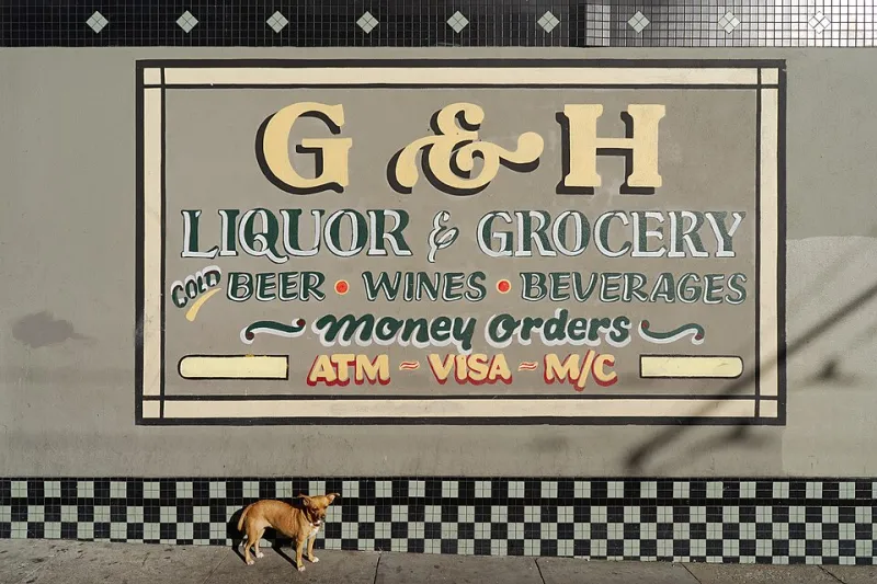
Photo: Nicolas Lannuzel from Singapore, Singapore, CC BY-SA 2.0, via Wikimedia Commons
There is a particular hour in a British market town when the street changes hands. The last café stacks its chairs, the hardware shop pulls its blinds, and one by one the shutters come down. What was a row of windows becomes a row of painted panels: a loaf, an anchor, a pair of scissors, a sun setting over a beach that exists only on corrugated steel. The shop is closed. The gallery is open.
The exhibition after the last customer
Most of us pass these shutters in daylight, when they are folded away or half-hidden behind rails of postcards and buckets. But the hand-painted ones have a second life after closing time. They are public art with a hinge and a lock, visible only to people who happen to be walking home late, waiting for a bus, or noticing the street after the crowds have gone.
A shutter mural is a strange kind of commission. It has to advertise a business while also being a security measure. It has to survive weather, graffiti, delivery trolleys and the daily violence of being rolled up and down. And because most shutters are slatted, the image is interrupted by horizontal lines — a seagull becomes a sequence of pale dashes, a shopkeeper’s name is sliced into stripes. The art is always slightly broken by its own mechanism. That may be why it feels so particular.
A typographic holiday
The lettering is often the best part. Shop names appear in cheerful scripts, blocky sans-serifs, wonky drop shadows and hand-cut curves that no design system would sanction. A café might announce itself in fat cream letters against a burgundy ground; a hardware shop might use a no-nonsense red and yellow that looks like a warning label designed by someone who really likes paint tins.
These are not neutral fonts. They are local accents. The lettering carries the mood of the place: seaside optimism, suburban practicality, the slightly hopeful italics of a business that has been ‘under new management’ since before anyone can remember. On a good shutter, the typography and the image argue pleasantly with each other. On a great one, they look as if they were painted by the same hand on the same afternoon, which they probably were.
Motifs and messages
Seaside kiosks lean into ice creams, deckchairs, waves and cartoon gulls. Cafés go for cups, beans and the ghost of a croissant. Hardware shops favour keys, saws and paint tins. Chemists, barbers, butchers and bakeries all have their own shorthand, a visual vocabulary that can be read from across the road. Some shutters carry community messages, local landmarks or portraits of the people who run the place. Others are simply a name and a colour, which is its own kind of confidence.
A shutter is a shop’s bedtime story. It tells you what the place wants to be remembered for while it sleeps. It also tells you something about the street: which businesses have been there long enough to commission a mural, which have inherited one from a previous owner, and which have painted over the old sign with a roller and a shrug.
What the weather does
Weather is the unpaid co-author. Salt air bleaches seaside blues. Sun cracks the cream on a café front. Rain gets behind the paint and lifts it in small, satisfying flakes. Diesel and footfall add a grey wash at the bottom, where the shutter meets the pavement. The result is a palimpsest: an older sign showing through a newer one, rust blooming through a field of blue, a repair patch that looks like a cloud.
Faded is not the same as failed. A weathered shutter has a texture that a new one cannot buy. The colours soften, the lines wobble, and the whole thing starts to look like a memory of itself. That is not a defect in the art; it is the art continuing without permission.
The plain roller problem
Many of these shutters have been replaced by plain metal, perforated panels or roll-down security grilles. The reasons are practical: cost, maintenance, insurance, vandalism. No one is arguing that every shutter must be a mural, or that a shopkeeper should choose paint over peace of mind. But a plain shutter is not neutral. It is a visual mute button. It removes a small piece of local distinctiveness from the street and replaces it with a surface that says only: nothing to see here.
In 2026, as high streets continue to change, the choice matters. A painted shutter can be part of a conservation area’s character, a reason to look up, a low-cost way to make a parade of shops feel less like a corridor of shutters and more like a place. It can also be a headache: who repaints it, who owns the design, what happens when the business changes? These are real questions. But they are questions worth asking before the roller comes out.
How to look
Walk a high street after closing time. Look for the shutters that have clearly been painted by hand rather than printed by a machine. Notice how the slats interrupt the image, and how the image was designed around them. Look for signatures, dates, old layers and repair marks. Photograph straight on, not at an angle, so the streetlight does not turn the whole thing into a glare. Then look again in the rain, when the colours deepen and the painted beach looks almost convincing.
The best shutter art is not in a gallery. It is on the way to the bus stop, waiting for the town to go quiet. It opens at six and closes at nine the next morning. Blink, and you will miss it.