From Milk Crate to Wheelie Bin: Ten Ordinary UK Objects That Belong Behind Glass
Museums are good at frames. Put a chair on a plinth and it becomes design history. Leave the same chair at a bus stop and it becomes weather. Britain's design story is usually told through the angled poetry of a Tube map or the legs of an Ercol chair. All worthy. But the objects most of us actually touch are humbler: crates, cones, bins, forks. In 2026, as high streets and services change, these things deserve a label. Not because they are precious, but because they are evidence.
Here are ten nominations. No ranking. Just a small case for looking twice.
1. The milk crate
Stackable, hoseable, faintly sticky. The milk crate is a quiet masterpiece of distribution design. It was made to carry bottles from float to doorstep; it ended up carrying records, books, vegetables and the entire contents of a student flat. Its grid is a lesson in strength and ventilation. Its colours are a local authority in plastic form.
Museum label: Milk crate, high-density polyethylene, 1970s to present. Designed for milk, repurposed for everything. Donor: unknown.
2. The bus shelter
A room with no walls and a timetable. The bus shelter is civic architecture at its most democratic: glass, steel, a bench that discourages sleep, an advert for something you do not need. It frames waiting, which is most of urban life. The best ones are modest. The worst ones are replaced by screens.
Museum label: Bus shelter, steel and glass, late 20th century. Provides shelter, shade and a stage for local notices. Location: the edge of the high street.
3. The chip fork
Two wooden prongs and a small ambition. The chip fork is a disposable tool with a class history: seaside, Saturday, newspaper, vinegar. It is designed to be used once and lost in a pocket. Its shape is almost prehistoric. It tells you that design is not always about permanence. Sometimes it is about the exact moment when hot chips meet a walk home.
Museum label: Chip fork, birch wood, mid-20th century to present. Single use. Carries salt, vinegar and memory.
4. The wheelie bin
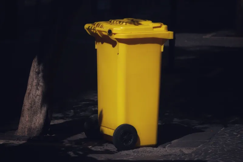
The wheelie bin is a piece of domestic infrastructure that looks like a friendly monolith. Hinged lid, two wheels, a colour-coded contract between household and council. It organises the week: what goes out, when, whether the lid is shut. It has changed the sound and smell of British streets. It is also a design object with a moral: waste is a system, not a secret.
Museum label: Wheelie bin, 240 litres, high-density polyethylene, 1990s to present. Wheeled, lidded, occasionally misidentified as a hedgehog shelter.
5. The council grit bin
Bright yellow, usually half-empty, often surrounded by a small snowman of spilled grit. The grit bin is winter infrastructure and a lesson in optimistic design. It assumes someone will need it and someone else will fill it. Its lid is a small public promise. In a country that treats weather as a personal failing, it is almost communitarian.
Museum label: Grit bin, glass-reinforced plastic, late 20th century. Contains salt, hope and a faint smell of wet gloves.
6. The beer mat
Beer mats are thrown away by the thousand, which makes them easy to ignore. But they are brilliant little design commissions: absorbent pulp, a printed ad, a square of temporary art. They record breweries, pubs, festivals and forgotten brands. They also record behaviour: the ring of a glass, the nervous fidget, the folded corner.
Museum label: Beer mat, pulp board, 20th century to present. Absorbs condensation and conversation. Collection: every pub drawer in Britain.
7. The supermarket trolley token
A tiny plastic disc that lives on a keyring and is never there when you need it. The trolley token is a design solution to a design problem: how to make people return a trolley without paying them. It is also a fragment of retail psychology. The coin deposit, the chain, the moment of small panic at the car park.
Museum label: Trolley token, injection-moulded plastic, 21st century. Simulates a pound coin. Often borrowed, rarely returned.
8. The laminated 'No Ball Games' sign
Laminated, zip-tied, ignored. The No Ball Games sign is a piece of public-space design that tells you more about adulthood than childhood. It marks a boundary, a liability, a patch of grass that someone has decided is not for playing. Its typography is usually bad. Its authority is usually fragile.
Museum label: Sign, A4 laminate, late 20th century to present. Prohibits ball games. Provides a goalpost in the imagination. Condition: slightly peeled.
9. The corner-shop awning
Faded scallops, a brand name, a strip of shade. The corner-shop awning is high-street architecture at its most improvised. It protects fruit, newspapers and the person having a cigarette. It is also a canvas for local identity: the shop that has been there for forty years, the name that has been repainted twice.
Museum label: Awning, PVC and steel, mid-20th century to present. Provides shade, advertises bread, records sunlight. Donor: the family that never threw it away.
10. The charity shop price tag
Small, handwritten, often mysteriously priced. The charity shop price tag is a fragment of the circular economy and a piece of social design. It turns a donated object into a transaction and a transaction into a cause. The handwriting is the human interface. The colour is the shop's branding. The price is a negotiation between optimism and reality.
Museum label: Price tag, card and string, 20th century to present. Attached to a vase, a coat, a jigsaw. Value: more than it says.
None of these objects are rare. That is the point. A museum label does not have to mean a velvet rope; it can mean a second look. The milk crate and the wheelie bin are fragments of design history because they show how Britain organises daily life: deliveries, waiting, waste, weather, chips. In 2026, as high streets shift and public services are argued over, these ordinary things are worth preserving — not as nostalgia, but as evidence. Put one on a plinth and it will look strange. That is how you know it is design.