The Gatepost Glyphs: Britain’s Handmade House Numbers and the Art of Being Slightly Off-Grid
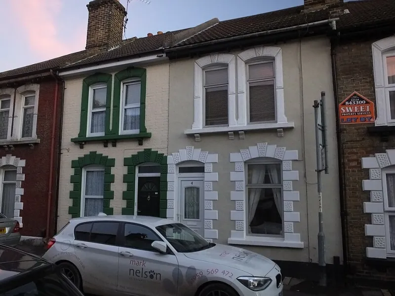
Photo: Photograph by Clem Rutter, Rochester, Kent. (www.clemrutter.net)., CC BY-SA 3.0, via Wikimedia Commons
On a road where the numbers are supposed to run neatly from 1 to 47, you will find 11, then 11a, then 11½, then a gatepost announcing “Dunroamin” in letters that lean like they have had a long lunch. Somewhere further along, number 13 has quietly disappeared, as if the street decided not to risk it. This is not chaos. It is something closer to accidental folk typography — a handmade system of signs that tells you far more about a place than the official street name ever could.
The Rules Were Never Really Rules
Britain’s house numbering has always looked more orderly on paper than it does at the kerb. Postal reform, local improvement acts and the slow expansion of towns gave us the idea of numbered streets, but implementation was patchy. Some terraces were numbered when they were built; others were named and only grudgingly numbered later. Rural lanes often resisted the whole business for decades. Even now, a delivery driver can find themselves following a sequence that seems to have been drawn up by a committee of squirrels.
That is where the improvised number comes in. A painted “2A” on a gate. A ceramic tile set slightly askew beside a door. A brass plaque screwed to a wall because the original numeral fell off in 1987 and was never replaced. These are not grand civic gestures. They are small, practical acts of self-publishing, and they are everywhere once you start looking.
A Field Guide to the Front Gate
The handmade house number is a broad church. There is the hardware-shop stick-on numeral, silver or gold, usually applied at a height that suggests the owner was standing on a stepladder that wobbled. There is the hand-painted gatepost, white gloss on dark wood, with the number squeezed above a name that may or may not have an apostrophe. There are ceramic tiles, sometimes spelling out the number in a font that owes something to a pub quiz board. There are laminated A4 sheets taped inside a porch window, and there are wheelie bins stencilled with the house number in a defiant act of kerbside legibility.
Misspellings are part of the charm. So are missing numbers, extra letters, and the occasional proud “The Nook” where a numeral should be. None of this is a failure of design exactly. It is design happening without a design brief — a front-gate version of the scrapbook, the shed and the noticeboard. The result is a kind of local typography that is more honest than anything you will find in a style guide.
What the Half Actually Means
Number 11½ is the great quiet oddity of the British street. It usually means something happened. A house was split. A annexe appeared. A family member needed a separate door. A plot was carved out of a garden and the planners required an address, but not a whole new number. The half is a paper trail in miniature, a record of compromise, extension and the ways buildings change their minds over time.
The same is true of the A, B and C suffixes that cluster around older roads. They are bureaucratic afterthoughts that have become part of the landscape. You can read a street’s history in its increments: the original terrace, the infill, the converted coach house, the flat above the garage. The numbers do not just tell you where you are. They tell you what has been done to the place.
The Politics of the Gatepost
There is also a quiet politics to all this. A house number is a small claim on identity. It says: this is mine, this is where I live, this is how you find me. But it is also a negotiation with authority. Royal Mail wants legibility. The council wants consistency. Satnav wants a clean data point. The householder, meanwhile, wants a gate that looks nice and a number that does not ruin the symmetry of the front wall.
The results are often gloriously imperfect. A street may have three different typefaces in twenty metres. One house will have a smart enamel disc; the next will have a hand-painted number half-hidden by a climbing rose. Somebody will have painted the number on the kerb, which is technically not allowed and practically very helpful. Somebody else will have ignored the whole system and named the house instead, leaving couriers to perform a small act of detective work at the end of the drive.
An Archive You Can Walk Through
What makes these signs worth noticing is not that they are beautiful, though some are. It is that they are evidence. They show how a street has grown, how a building has been divided, how a family has decided to announce itself to the world. They are the opposite of a heritage plaque. Nobody commissioned them. Nobody curated them. They simply accumulated, one gatepost at a time.
So next time you walk a residential road, read the numbers as a sequence of small editorial decisions. The missing 13. The 11½. The nameplate with the misplaced apostrophe. The numeral that has faded to a ghost. They are fragments of local history, pieced together at the front gate — and, like so much of the best everyday design, they are better for being slightly off-grid.