The Square That Holds a Pint: Britain’s Beer Mat as a Tiny Archive

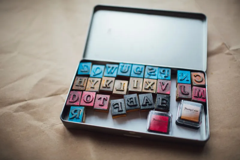
Photo by Photo by Donald Teel on Unsplash on Unsplash
There is a particular sound a beer mat makes when it leaves a pub table: a small, dry peel, half cardboard, half apology. It has done its job — caught the ring, absorbed the spill, given the glass somewhere to sit — and now it is ready for the bin. Most go that way. A few get folded into tickets, scribbled on, pocketed by accident or rescued by someone who likes the colour of the ink. Almost none are designed to be kept. That is exactly why they are worth looking at.
The grammar of the pub table
The standard British beer mat is not a glamorous object. It is pulp board, usually around nine or ten centimetres square, sometimes round, occasionally hexagonal if the brewery is feeling playful. It is printed in a handful of spot colours, often on the cheap, and built to do one thing well: stand between a cold drink and a wooden table. The design brief, if there ever was one, is absorbency first, legibility second, charm somewhere further down the list.
Yet the mat is a dense little document. There is the brewery name, the crest, the font that has not changed since the 1970s, the slogan, the responsible-drinking line, the space for a local taxi firm or a darts team or a carvery. The typography is often better than it needs to be. A mat for a regional ale might carry a Victorian-style serif, a cartoon animal, a motto in Latin, a map of a river valley. A mat for a lager might be almost blank: one word, one colour, one promise. In both cases, someone made choices. Someone signed off a print run of fifty thousand.
A regional atlas in pulp
Beer mats are local newspapers that nobody files. They tell you what a pub wants you to know: which brewery owns it, which charity quiz is on Thursday, which window cleaner covers this postcode, which meat raffle is not to be missed. They carry the names of small enterprises that never get a graphic identity anywhere else. A taxi number set in Comic Sans. A butcher’s advert with a cow drawn from memory. A funeral director’s discreet line at the bottom, because pubs are where all of life passes.
When a pub changes hands, the mats change first. The old brewery logo disappears under a sticker or a new print run. The font gets rounder, the colours brighter, the responsible-drinking message longer. If you have a drawer of old mats — and plenty of people do, often without meaning to — you have a rough timeline of ownership, takeover and rebrand. It is not the official archive. It is the one that ended up under a pint.
Hand corrections and late-night marginalia
The printed mat is only half the story. The other half is added in Biro. A quiz answer corrected in furious capitals. A phone number with the last digit gone over twice. A score for a darts match. A small drawing of a dog. A line from a song that seemed important at eleven o’clock. The pulp board takes ink badly, so every mark has a slight bloom, a fuzzy edge, as if the mat is thinking about it.
These are not artworks, and they are not meant to be. They are traces. A mat with “BACK AT 8” written on it is a note to self. A mat with two names and a heart is a receipt for an evening. A mat with a carefully shaded pint glass is someone passing time while waiting for someone else to finish a story. The pub table is a studio, a desk and a confession booth, and the mat is the nearest thing to paper.
What disappears when the pump goes quiet
Britain’s pubs have been closing for years, and with them goes a particular kind of printed ephemera. The beer mat is not a grand artefact. It does not get catalogued like a poster or a enamel sign. It gets damp, torn, used to mop up a spill, and thrown away. When a pub closes, the mats often go with it — into skips, into boxes, into the hands of regulars who take one as a keepsake and then find it years later, soft at the edges and smelling faintly of cellar.
That loss is not just sentimental. It is a gap in design history. The mat is where brewery identity meets local advertising meets the practical needs of a wet table. It is where a national brand has to share space with a darts team from a village hall. It is where typography becomes furniture. In 2026, with pub lists and brewery portfolios still shifting, the humble coaster is one of the few places where that whole ecosystem is printed on one small square.
How to read one
Next time you are handed a mat, give it a second. Hold it to the light and look at the print registration — the slight misalignment of colours, the dot pattern, the edge where the blade cut. Check the overprint. Check the back. Look for the small print that names the printer, the paper merchant, the date code. Then look at the table around it: the ring marks, the scratches, the initials carved into the wood. The mat is part of that surface. It is designed to be temporary, and that is what makes it a record.
You do not need to start a collection. One mat from one pub is enough. Slide it into a book, write the date on the back, and let it sit there. It will not look like much. But it will be a fragment of a night out, a local economy, a brewery that may not exist in ten years, and a table that has heard everything. The square that holds a pint holds a little more than that, if you let it.